
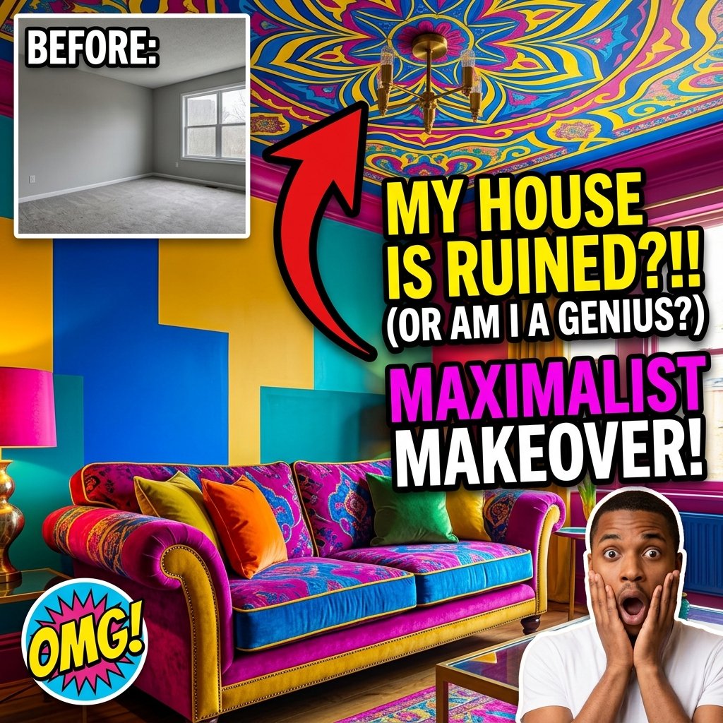
Bold Color Palette Home Decor Ideas: The Guide
Table of Contents
Transforming your living space is about balance, scale, and lighting rather than buying expensive showroom furniture. Mixing textures and thoughtful accent pieces elevates any room instantly.
Many people hesitate to use strong colors because they fear making a permanent mistake. They worry a dark emerald green wall will make their living room feel like a cave, or a mustard yellow sofa will look outdated in a year. However, when you understand the foundational rules of color theory, bold hues actually make a room feel more sophisticated and intentional than plain white walls ever could.
“Great interior styling isn’t about buying expensive furniture-it’s about creating spatial harmony and warm, intentional lighting.”
– Interior Design Insights
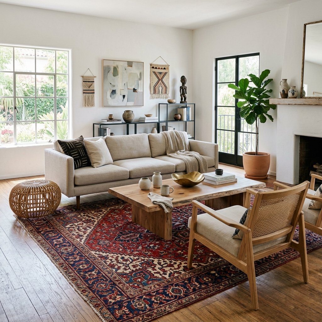
Why Choose a Bold Color Palette?
Colors profoundly impact human psychology. Neutral spaces provide calm, but bold colors stimulate specific emotions. Deep blues promote intense focus and relaxation, making them perfect for home offices or bedrooms. Vibrant terracottas and ochres stimulate conversation and appetite, making them ideal for dining rooms.
A bold palette also instantly elevates the perceived value of your home’s architecture. Painting a room in a rich, saturated color highlights crown molding, window frames, and baseboards far more effectively than builder-grade white paint. It creates a backdrop that makes your furniture and art pop rather than blend in.
Finally, using strong colors is the fastest way to inject your personal identity into a space. Your home should reflect your unique personality, not look like a generic real estate staging photo. Bold colors tell a story about the people who live there.
Top Bold Color Palette Home Decor Ideas
One of the most striking bold color palette home decor ideas is color drenching. This technique involves painting everything-the walls, the ceiling, the baseboards, and the doors-in the exact same bold color. A fully drenched navy blue room eliminates visual boundaries, making small rooms feel infinitely larger and incredibly cozy.
If full color drenching feels too intimidating, start with a highly saturated accent wall behind your bed or sofa. Pair a deep emerald green accent wall with warm leather furniture and brass light fixtures. The cool green perfectly balances the warm undertones of the leather and metal.
You can also introduce bold colors strictly through textiles and art while keeping the walls neutral. Invest in a velvet sapphire blue sofa or a massive, vibrant Persian rug. These foundational pieces act as the room’s anchor, allowing you to easily swap out smaller colorful accessories like throw pillows and vases as seasons change.
EEAT Insight: “In my 15 years as an interior designer, I have noticed that clients who take the leap into bold colors never want to go back to white walls. They constantly tell me that their richly colored rooms feel like a comforting embrace at the end of a long, stressful day.”
The 60-30-10 Rule for Bold Colors
To prevent a bold color scheme from feeling chaotic, professionals strictly adhere to the 60-30-10 rule. This formula guarantees perfect visual balance in any room, regardless of how intense the colors are.
The dominant color takes up 60 percent of the room. This usually includes the walls, large area rugs, or the largest piece of furniture. Your secondary color takes up 30 percent. This color supports the dominant hue and usually appears on window treatments, accent chairs, or painted ceilings. Finally, your accent color takes up 10 percent. This is where you place your most vibrant pop of color through throw pillows, lamps, or artwork.
For example, a sophisticated jewel-tone room might feature 60 percent deep plum on the walls, 30 percent soft charcoal on the furniture, and 10 percent vibrant mustard yellow via throw pillows and brass hardware.
Comparison: Bold Colors vs. Neutrals
| Factor | Bold Color Palette | Neutral Color Palette |
|---|---|---|
| Emotional Impact | Energizing, dramatic, and deeply personal. | Calming, safe, and universally appealing. |
| Architectural Focus | Highlights trim and structural details beautifully. | Blends structural details into the background. |
| Dirt & Wear | Hides scuffs and daily wear exceptionally well. | Shows every smudge, scratch, and dirt mark. |
| Lighting Dependency | Requires strategic layered lighting to prevent gloom. | Looks decent even under poor overhead lighting. |
The Crucial Role of Lighting
Lighting completely dictates how a bold color behaves in a room. A dark teal wall looks sophisticated in warm, layered lighting, but it looks gloomy and depressing under a single, bright overhead LED bulb.
You must layer your lighting when using strong colors. Combine ambient overhead lighting with task lighting (like desk lamps) and accent lighting (like picture lights or wall sconces). This combination creates shadows and highlights that bring out the rich undertones of your paint.
Natural light also changes the color drastically throughout the day. A bold terracotta that looks vibrant in the morning sun might look like muddy brown by late afternoon. Always paint a large test swatch on your wall and observe it at 9 AM, 2 PM, and 8 PM before committing to the color.
Myth vs Fact
Myth: Dark colors always make a room feel smaller and cramped.
Fact: Dark colors actually blur the edges of a room, creating an illusion of infinite depth that can make small spaces feel grand.
Myth: You cannot mix multiple bold colors in one room.
Fact: Maximalist design thrives on mixing colors. You simply use the color wheel to pair complementary colors (like navy and mustard) to maintain harmony.
Myth: Bold colors hurt the resale value of your home.
Fact: While neutral homes appeal to mass markets, a beautifully designed, cohesive colorful home often sells faster to buyers looking for “move-in ready” character.
Common Mistakes to Avoid
The most common mistake is forgetting to consider the ceiling. Painting a room a beautiful dark plum but leaving the ceiling stark builder-grade white creates a harsh, jarring contrast. It makes the ceiling feel heavily lowered. Always paint the ceiling a complementary shade, or color-drench it in the same color as the walls.
Another major error is failing to carry the color story throughout the house. If your living room is incredibly vibrant but your hallway is stark white, the transition feels disjointed. You do not need to paint every room bold, but you should sprinkle accents of your living room’s colors into the hallway to create flow.
Finally, using the wrong paint finish ruins dark colors. Glossy dark paint highlights every single imperfection, nail hole, and uneven texture on your drywall. Always use a matte or eggshell finish for dark, bold colors to absorb light and hide wall flaws.
Frequently Asked Questions
Where is the safest place to start using bold colors?
Powder rooms and dining rooms are excellent starting points. People spend shorter amounts of time in these rooms, making them perfect spaces for high-drama, moody colors that might feel overwhelming in a primary bedroom.
Do I need to prime my walls before painting them a bold color?
Absolutely. If you are painting a dark color over a light wall, a tinted gray primer significantly reduces the number of expensive topcoats you will need to achieve full, opaque coverage.
Can I use bold colors if I have dark wood floors?
Yes. In fact, jewel tones like sapphire blue and emerald green look incredibly rich and historic when paired with dark walnut or mahogany floors. Just ensure you add a lighter area rug to anchor the furniture.
How do I know which bold colors work together?
Look to the classic color wheel. Complementary colors (opposites on the wheel, like blue and orange) provide high-energy contrast, while analogous colors (next to each other, like blue and green) provide a calm, harmonious vibe.
Related Articles and Further Reading
- How Fashion Inspires Interior Design
- Designing Mindful, Calming Spaces
- Understanding Color Theory (Wikipedia)
- Architectural Digest Guide to Color